Wednesday, 22 April 2015

Interview: Levi van Veluw

by  George Upton  I  digiQualia.com
A monochromatic room, lined with large, tall bookshelves onto which are neatly placed 1500 icosahedrons, is subject to an inexplicable force. Slowly, leisurely, gracefully, the shelves fall into one another, the shapes drifting to the floor and scattering, until the action slows further and finally stops. 


Archive, 2013, charcoal on paper, 205x120cm. Courtesy of the Rosenfeld Porcini Gallery.
Cohesion is a series of short films based on drawings that aim to explore the struggle between order and the forces of nature. Such fundamental questions about the nature of our universe run throughout  the practice of Levi van Veluw whose major exhibition at Marres Maastrict, The Relativity of Matter, opens in October. The product of a year’s work, the show will cover an area of 400m² and comprise a series of interconnected doors, corridors, atmospheres, perspectives and colours. digiQualia spoke to Levi as he was preparing for the exhibition.

What attracts you to working in wood?
In my work I'm questioning the way we look at chaos. Mankind developed a way to look at the world with their own logic and rules. It's a ongoing conflict between nature and the laws of physics, and our obsession to control our surroundings. The material needed to support this concept - wood is a natural material grown in a organic way. I find it interesting that we shape the organic form of the wood into something symmetrical, something that relates to our logic. The struggle of men to control there surroundings can be found in this reshaping of wood.


SPHERES, 2014, single channel HD video, 9'45". Courtesy of Rosenfeld Porcini Gallery.
When figurative, much of your work is based on photographs and scans of yourself. Why is this? 
I started making self-portraits at art school. The choice of using myself was more practical than conceptual. These works were a way to experiment with something so familiar, in combination with materials that we experience in daily life. These I applied as a structure to transform the face into an object. But as my art evolved, using my face became a choice. At the moment self-portraiture does not feature in my work, but my new works are conceptually linked to a fascination with myself.

There seems to be a tension between technology and the manmade in your work. Could you expand on how you view this relationship?
The choice of not using digital manipulation is quite simple. The whole concept in my work is that it is about reality while appearing surreal. It is a combination of performance, experiment and aesthetics. The use of digital manipulation would interfere with this concept. For example, a cube made on a computer means total control, total perfection, whereas a perfect cube in reality is relative. 

Throughout art history, artists have always been confronted with new technology and materials - it’s nothing new. I think it’s very uninteresting when artists make a point of using new technology like 3D printing. Of course, new technologies are valid, it just shouldn’t be solely about the technology. Anish Kapoor was given the opportunity to work with Vantablack, the blackest substance known, made of carbon nanotubes. The material is already so amazing that I’m curious how he is going to make an artwork that is more than the material itself.


SPHERES, 2014, single channel HD video, 9'45". Courtesy of Rosenfeld Porcini Gallery.
You recently presented the video work Spheres at Moving Image New York. What was your inspiration for this new work and your thought behind The Collapse of Cohesion, the series from which Spheres was taken?
The high-speed camera I used (1500 frames per second) captures the moment where our logic is exposed to the force of nature, turning the controlled surroundings and structure into something new. By exposing this transition the cohesion becomes more comprehensible. 

Wednesday, 15 April 2015

Bernard Plossu at the Maison Européenne de la Photographie

by  George Upton  I  digiQualia.com
The Maison EuropĂ©enne de la Photographie was founded in 1996 in Paris. Situated in the Marais, just south of the Pompidou Centre, it is not often listed amongst the top locations in the city. Like its hidden, unassuming entrance, this exhibition space, lecture theatre and library split between a 18th century house and a contemporary extension, is a secret, underrated gem.

In addition to revolving programme of exhibitions, the MEP also draws from its vast collection of over 20,000 works of art, mostly photography, from which it also forms exhibitions. When I went earlier this month, I was introduced to the fantastic work of Bernard Plossu in a comprehensive display of his photographs of Italy.


Bernard Plossu's exotic beginnings, born in Vietnam in 1945, seem to have inspired a wanderlust that has run throughout his life and work. With most of his practice he documents his travels across the world and it is with his lens turned to Italy that the exhibition focuses on at the MEP.

For Plossu Italy has always contained a magic that evokes his distant heritage, art and the landscape, and it is this sense of a personal take on Italy that permeates the photographs. It is undeniably Italy - the vast, changing countryside from Piedmont to Sicily, the beaches, the people and their fashion - but it is not a cliched Italy of tanned fashionistas eating ice cream and pasta. The weather, for example, is often far from the typical Mediterranean sun and there’s a simple truth in Plossu’s Italian clouds and rain that makes the work convincing. As Plossu himself said: ‘bad weather is good weather for a photographer’


But more than this, both the black and white and colour photographs exhibited at the MEP are not rendered in sun-bleached hues but an altogether more nuanced and original palate. For colour, Plossu’s images are faded and the contrast is blurred, as if his film has been developed with chalk. They are rich but subtly so, unnatural in a natural way and timeless but, in the case of many, contemporary.


Although Plossu’s technique for colour is spectacular, and these digital representations do not do it justice, the highlight of the exhibition was his small format, black and white landscape photographs. Tucked away in a low-lit niche, these images were taken over the past twenty years but dismiss being set in a particular time. They are small and to properly view them you have to go close, your periphery washed out by the large white boarder around the image - an effective piece of theatre that disconnects you from your surroundings. Richly contrasted and printed with minute detail, there is nothing lost in the small size of the reproductions and they are all the more engaging for their peephole-like apertures onto ancient hillside villages, black foreboding hills, and glistening modern infrastructure.


This is not the Italy of the cinema and travel brochures. But neither is this the Italy that you can experience. This is Italy as understood by Plossu - a compelling, nuanced and original perspective that liberates a country often calcified by its rich culture and traditions.


All pictures copyright of Bernard Plossu, courtesy of the MEP

Thursday, 19 March 2015

Cesare Lucchini at Rosenfeld Porcini

by  George Upton  I  digiQualia.com
In one of his trips to the region in 1841, the English painter J.M.W. Turner made a watercolour sketch of the town of Bellinzona in Switzerland, near the boarder with Italy. In a style that has become particular to the painter, he manages to blend the detail of the buildings with the vast, indistinct forms of the Swiss Alps, drenched liberally but precisely in colour. 

It is fitting that Turner is one of the first antecedents that comes to mind when looking at the large, richly coloured paintings of Cesare Lucchini, who was born in the same town exactly 100 years later. Currently exhibited at the Rosenfeld Porcini gallery in London, at first glance Lucchini’s paintings appear completely abstract. On closer inspection, amidst the colour there appears human forms, most mutilated, often disembodied, amidst the detritus of battle - barbed wire twisting over and into limbs.

Quel Che Rimani, 2011, oil on canvas

From Battlefield to Paradise, then, is an appropriate title for the 74 year old Swiss artist’s work. On meeting him at the exhibition’s opening, the artist had a liveliness that belied his age. It would be easy to presume that the scenes of suffering in his paintings, the remnants of war revealed as the dust settles, are imagined. But, having been born in the middle of the Second World War, in the centre of a continent engulfed in fighting, Lucchini’s work speaks of the destruction that was being wrought in Europe.

Like his contemporary Anselm Kiefer, there is a sense of coming to terms with the mechanised warfare that erupted and subsided around Switzerland in the middle of the last century. Lucchini has always focused on catastrophic events throughout history, reflecting the 2010 oil slick in Mexico, the drowning of many refugees attempting to reach Sicily and the use of child soldiers in his work. In this series of paintings, however, the artist speaks more generally about the human condition and its inability to overcome its limitations.

Those Who Remain - The Fall, 2013, oil on canvas

Significantly, echoing Turner’s sketch of Bellinzona further, through the windows of the many rooms in his paintings Lucchini has depicted snow covered mountains, suggesting he is placing his rumination on human suffering within a context he is familiar with. The Swiss backdrop can also be understood as the unattainable heights that man attains to, but can never achieve. They are the paradise that, invented by man, invented by Lucchini in his paintings, sustains those who face death.

There’s much meaning in Lucchini’s paintings at Rosenfeld Porcini and, as evident in this review, it is easy to overlook their formal qualities. And yet as much as the artist can discuss the universal, elemental nature of humanity, he also has a masterly command of his medium and colour. In these works the barbaric, horrifying scenes are made more poignant, more significant by the striking and attractive way in which they have been painted. Their content aside, Lucchini’s paintings are horribly beautiful to look at. 

A Very Rough Path, 2015, oil on canvas


From Battlefield to Paradise runs until 21st March at Rosenfeld Porcini in London.

Wednesday, 4 March 2015

Mehdi Ghadyanloo

by  George Upton  I  digiQualia.com
We have a tendency to over-simplify the Middle East. There has been a huge debate over figurative depiction in Islam since the shootings at the offices of Charlie Hebdo in Paris. Through the violent actions of a few fanatics and the peaceful protests of many, we are told that depicting the human form, let alone the Prophet Mohammad, is banned within the Islamic faith. And yet, as Dr Sussan Babaie, a professor in Iranian and Islamic art at the Courtauld Institute of Art states, “in Iran, the body never really disappeared”. 


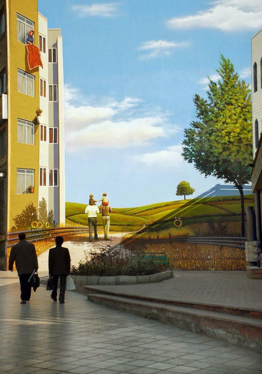
Nowhere is this clearer than in the art of Iranian muralist Mehdi Ghadyanloo, whose first exhibition in the UK (and only his second outside Iran) has just opened at the Howard Griffin Gallery in London. Employed by the Tehran municipality, Ghadyanloo paints vivid, colourful, surreal and, importantly, figurative murals on the expansive blank walls that are so prevalent in Tehran. Continuing the long tradition of mural painting in Iran, Ghadyanloo updates the martyr murals from the Iran-Iraq war and the visual hagiographies of the leader of the Islamic Revolution, Ayatollah Khomeini, and Mohammad by painting non-political subjects that are simply designed to make the people of Tehran happy.


Ghadyanloo did not plan to paint murals as his profession but, having left university and needing money, he responded to a call for artists by Tehran’s Beautification Bureau. Taking ten designs to be judged, and impressed by the fact that they were done so on strictly non-political terms, he was accepted and told to start the next day. Once he had completed his third work, the mayor of Tehran rang the manager of the Beautification Bureau to ask who had done his murals and when he discovered who it was, the manager was told to give all the walls in Tehran to Ghadyanloo.


Ghadyanloo has been doing what he can to beautify Tehran for eight years. During this time he has painted over 100 murals and, notably, on mosques in the city. Far from eschewing his fanciful, fantastical designs, one mosque, for whom the decoration was free, asked Mehdi to paint a second wall. The idea that Islam rejects figurative depiction is here laughable - not only has Ghadyanloo painted the image of a man but he is not in Islamic dress and is flying as a result of two butterfly wings that have sprouted from his back. For many familiar with the street art of East London, the discovery that Ghadyanloo’s similar approach to urban painting is actively encouraged by the Iranian authorities will be surprising, and reminds us that Iran and the Middle East is much more complex than can be conveyed in the mass media.


Wednesday, 18 February 2015

Alibis - Sigmar Polke, 1963-2010 at the Tate Modern

by  George Upton  I  digiQualia.com


Before a friend suggested that we go to see his retrospective, I had never heard of Sigmar Poke. The extensive and comprehensive exhibition, just closed at the Tate Modern in London was, then, a welcome introduction to Polke and his work and, for an ex-Art Historian, I had the uncanny but not disagreeable experience of seeing a vast body of work fresh and unsullied by digital facsimiles. It was a small window into life pre-Internet, and I throughly enjoyed it.

However, unenlightened but curious, perhaps I was exactly who the Tate is aiming at. For the most visited museum in the world, the Tate Modern is surely conscious that its visitors are not all art literate and that many are drawn by the spectacle of the converted power station’s architecture and the sensational, large scale Turbine Hall installations. Indeed, as I began to walk around the exhibition, I did not notice my lack of preparatory research or prior knowledge of Polke. Picking up what information I needed from the wall panels and the booklet guide, I could drift, drawn from one work to another, following the whim of my fancy. 

Sigmar Polke (1941 - 2010)
Girlfriends (Freundinnen) 1965/66
© 2014 Estate of Sigmar Polke / ARS, New York / VG Bild-Kunst, Bonn


The relatively sparse hang (the exhibition benefited by occupying an entire floor of the Tate Modern) accommodated this relaxed approach to Polke’s work. The succinct introduction was enough to let you start bringing your own conclusions to his work. The short biography, for example - 

Born in Silesia in 1941, Polke had to leave his home with the advance of the Russian Army at the end of the Second World War. Again in 1953 he was displaced as his family fled East Germany to settle in Dusseldorf. He settled in Cologne in the late 1970s and died in 2010.

- immediately allows you to cast Girlfriends (1965-66) in its political and cultural context and interpret Polke’s anarchic take on popular imagery as a comment on the gaudy post-war Western consumerism that must have been startling to someone fleeing Communist East Germany. 

Like many of his contemporaries - specifically Pop Artists in England and America - Polke was drawn to comment on the rise of consumerism and mass media. He decontextualised mundane food stuffs and used images found from newspapers and adverts. And yet, unlike Roy Lichtenstein, who also recreated mass printing methods in paint and Richard Prince, who similarly reappropriated mass imagery, there is something particular and more sophisticated about Polke. In the work above, the artist has mimicked by hand the raster printing process (an method of organising dots of colour to form an image) but, doing so by hand, there is a human and even humorous feel in the ensuing imperfections. 

Sigmar Polke (1941 - 2010)
The Illusionist 2007
Private Collection
© The Estate of Sigmar Polke / DACS, London / VG Bild-Kunst, Bonn


And this sense of humour is present throughout the exhibition, tying together half a century of varied and disparate work. Police Pig (1986) is, at its most basic, very funny, and whether Polke is confronting Germany’s Nazi past or the non-Western cultures he encountered in his many journeys to Asia and South America, whether he is painting or taking photographs, there is this same wit imbued in everything he did. Although to look solely at these works for their humour is to over simplify them, it is this that gives him the edge on his fellow pop-commentating artists. This extra dimension serves to remind the onlooker that there are issues that need to be faced, discussions that need to be had, but that nothing should be taken to seriously.

Sigmar Polke (1941 - 2010)
Police Pig (Polizeischwein) 1986
© The Estate of Sigmar Polke / DACS, London / VG Bild-Kunst, Bonn


To have such a vast collection of work from throughout Polke’s creative life allows the viewer to freely draw together his work from across the decades and visually come to these conclusions. Many retrospectives allow you to do this but it was especially present here. It is a testimony to the curation, of course, but also to this astoundingly talented artist - whatever he turned his hand to, in his sketches and in his films, in his paintings and sculpture, he got it just right. I had no knowledge of Sigmar Polke before I came to the exhibition but I left thinking he was one the best artists of the latter half of the 20th century.

Friday, 6 February 2015

Interview: Aaron Blaise

by  George Upton  I  digiQualia.com 
For over two decades, Aaron Blaise animated and later directed films for Disney such as Beauty and the Beast, Aladdin, The Lion King, Pocahontas, Mulan and Brother Bear, where he specialises in drawing animals. Having left and set up his own animation studio, Blaise now runs his own website and youtube video channel that seeks to democratise teaching on art and animation. 

You have stated you always liked to draw, especially animals. What made you want to get into animation?
I actually fell into animation by chance. I trained as an illustrator at Ringling College of Art and Design from 1986-89. When I started there it was my goal to work for National Geographic as a staff illustrator. When I found out that these positions didn’t exist in the way that I was looking for I started looking elsewhere. I found out that Disney was coming to our school to interview so I put together a portfolio of my work thinking that maybe I would become a background painter. After I was accepted to a Disney internship I became hooked on animation through Glen Keane who was my mentor. It’s because of Glen’s inspiration that I’m an animator today.


Why the interest in animals?
I’ve always felt a bond with the creatures we share our world. For me it’s hard to define why because it’s just always “been” for me. Animals were the first subjects ever depicted through art on cave walls. I think for many of us we can empathize with them. We can feel a bond. 

And what is the process or methods you use to give animated animals expressions and emotions?
I really just feel my own emotions and expressions as I’m drawing a particular animal and attach those expressions to the character. I don’t use a mirror when animating. I never have. I instead end up actually making the expression as I’m drawing it whether on a human or animal. Through this “feeling” I can draw the expression more naturally. 


What was it like working at Disney?
Working for Disney for 21 years was an incredible honour for me. I was creating work that became part of some of the greatest animated films ever made. Working on films like “Beauty and the Beast”, “Aladdin”, and “The Lion King” were highlights of my career. Even more than the work though, we were an incredibly tight family. We all really kind of grew up together. Many of us started in our early twenties and we worked together into our forties. We went to each others weddings, watched each other have children. All while making great animated films. It was like a dream.

What was the best film to work on?
I loved working on Beauty and the Beast. It was my first big break as an animator and Glen Keane, who was supervising the Beast character wanted me as part of the animation unit. He was very generous with the scenes he gave me and it enabled me to shine as an animator. Because of that, I was able to take on bigger rolls and challenges on later films.

I also loved working on Brother Bear as a director. It was the first feature I directed and I learned an incredible amount in creating stories and their structure.


How has the development of technology affected the way you work?
The biggest effect technology has had on the way I work is that when it comes to animation and film development, I rarely work on actual paper anymore. I do almost 100% of my film work on my Cintiq. If I’m animating I use TVPaint on my Cintiq. If I’m doing design or concept work I’m using Photoshop on my Cintiq. Everything is digital now.

What do you think of the future of animation? Will there always be a place for drawn animation over 3D animation?
I don’t think there will ever be a place for 2D over 3D. I think there is a place for both equally though. If we can get the production costs down and create a great story then I think there will be a company in the future willing to take the risk on 2D again.


What are you hoping for with you online educational videos?
I really want to get art education out to a mass audience. I feel that art schools have gotten way too expensive and there might be some talented young people out there that will never be able to go to school because of the cost. That to me is a terrible shame. So, my business partners and myself decided we wanted to start getting art education out to those that may not be able to afford college or maybe they’re in college but are looking for supplemental material. Education should not financially ruin anybody.


Wednesday, 4 February 2015

Interview: Rosaline Shahnavaz

by  George Upton  I  digiQualia.com
Rosaline Shahnavaz is a photographer from South London. Although she only graduated from university last year, she is rapidly making waves across the diverse discipline of contemporary photography - spanning art, fashion and documentary in her work. Her high profile commissions, although a credit to Shahnavaz's seemingly unceasing work ethic, was aided by her outstanding final project, Far Near Distance - an intimate portrait of her cousin's closed life in Tehran juxtaposed with the unattainable beauty of the surrounding countryside and a series of letters that highlight Shahnavaz's relative freedom. For this she won both the Michael Wilson Award and an award from Photoworks.

Having honed her practice in the classrooms and darkrooms of the London College of Communication, Shahnavaz is now making her living as a photographer. I spoke to her about making the step from education to employment, the effect this and on her work and her recent exhibition at the Notting Hill Arts Club in London.

How have you found life post university? 

Post university life has been great. I mean, it has been very non stop. I'm almost too exhausted to be tired.

I've been teaching photography part time, shooting commissioned work, putting on exhibitions, working on personal projects. I guess it's what I've always wanted to do so I'm really embracing it and enjoying every minute of it. It's definitely a good kind of busy. 

Your work during your degree has been very personal, either because it documents those around you or because of the style in which they have been made. How will this be affected by you ever increasing renown and the subsequent commissions, such as that for C-Heads magazine?

Well, I first got into photography through intimate documentation of my friends, or those around me. It's very much the experience of getting to know someone, and the camera almost becomes secondary. I've never been about staging or shooting excessively to find the right shot. It's more about having experiences and capturing it in a photograph. This has translated into all of my work whether I'm backstage at fashion week, shooting a musician for a magazine, or documenting my cousin's poignant story for my degree show. It's always about the people and the relationships I build. That's what's more important to me. Obviously with the shoot such as the one for C-Heads I did have a time limit so it's a faster pace but I still seek to get to know my subjects in all situations. Their personalities need to come through. It's essential to my practice. 


Will you also therefore look towards fashion photography, as you have with TEETH magazine, or stick to a more artistic approach to image making? Or both?

I don't think I need to draw the line between the two. My art has influenced my commercial work a lot. They're not entirely different entities, they definitely influence one another. Doing both is really important to me. 


You were recently featured in a series of articles and a video for Nikon and The Telegraph, how did that come about? 

Yeah that was really fun. They were interested in my work and wanted to follow me shooting some personal work, so they documented me on one of my shoots with the Focus E15 group. It was kind of interesting to look back on a day in my life in a way, I'm often too busy to reflect on what I do so it was nice to sum it up in a few minutes. Although they did make me seem as though I was some sort of Nikon addict and cut out the parts where I discussed my love for my RB67 and my film cameras. I shoot film 95% of the time so I hope the video wasn't too misleading! I think it's revealed in the interview articles that followed it up.

Your recently mounted a solo exhibition, a feat in itself for a recent graduate, entitled Nothing In The World But You. What was the thinking behind the show?

So, Nothing In The World But You was a show of all my personal portraits of my friends that I have taken over the years. They're really almost unintentional photographs. Most of the time I was just a fly on the wall, but it's these photographs that have influenced the way I work with my subjects still today. The opening was really great, my best friend DJed and it was a great opportunity to get everyone together. It was nice, almost reflective. I've been so busy with commercial work so it was nice to kind of take a step back to where it all started. I had a lot of feedback about how intimate the photographs are, how personal they are, and how raw they are. That meant a lot. 


What are you working on/for at the moment? 


I was recently approached by Effra London to shoot their Valentines campaign. They're really into my personal photographs of my boyfriend and myself so they wanted me to more or less recreate these. So I just documented myself and Ben like I usually do but this time wearing some beautiful jewellery! It was such an organic and natural process which is what I love when photographing. I've also got a couple more editorials and some portraits for Topshop and Lula mag coming out soon so keep your eyes peeled!